Fire Resistant Cladding
If you are looking to install any type of cladding, including composite cladding, it is important to think about how
Products in Stock
Lowest Prices
Express Delivery
10-Year Warranty
Bank Holiday Sale. Up To 15% Off.
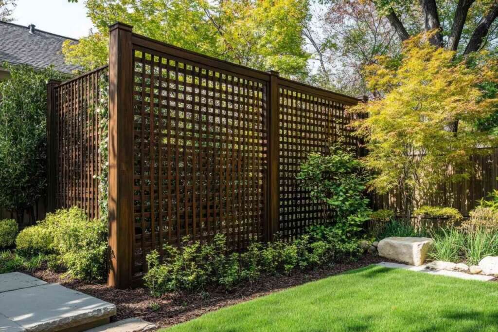
Ever stood in your garden and thought, “This would be perfect if only I had a bit more privacy”? Garden screens solve this problem brilliantly, but picking the right colour isn’t always straightforward. It might seem like a small detail, but trust us – the colour of your screen can completely transform how your outdoor space feels and functions.
We’ve seen countless gardens where beautiful screens look oddly out of place simply because their colour doesn’t work with the surroundings. Colour isn’t just decorative – it actually changes how we experience a space.
Here’s something interesting: darker screens tend to visually recede, making them appear further away than they actually are. This can be a neat trick if you want to make a small garden feel bigger. On the flip side, lighter colours jump forward visually and can help define boundaries in sprawling spaces.
Gardens aren’t static – they change dramatically throughout the year. That gorgeous screen that blends perfectly with summer greenery might stick out like a sore thumb in winter when the foliage disappears. We’ve had customers come back surprised at how different their screens look once autumn strips the surrounding plants bare.
Ever noticed how some gardens just make you feel calm the moment you step into them? Colour plays a massive role here. Blues and greens naturally promote relaxation (there’s a reason spas use these colours everywhere). If you’re creating a space for entertaining, warmer shades like terracotta might better suit the vibe you’re after.
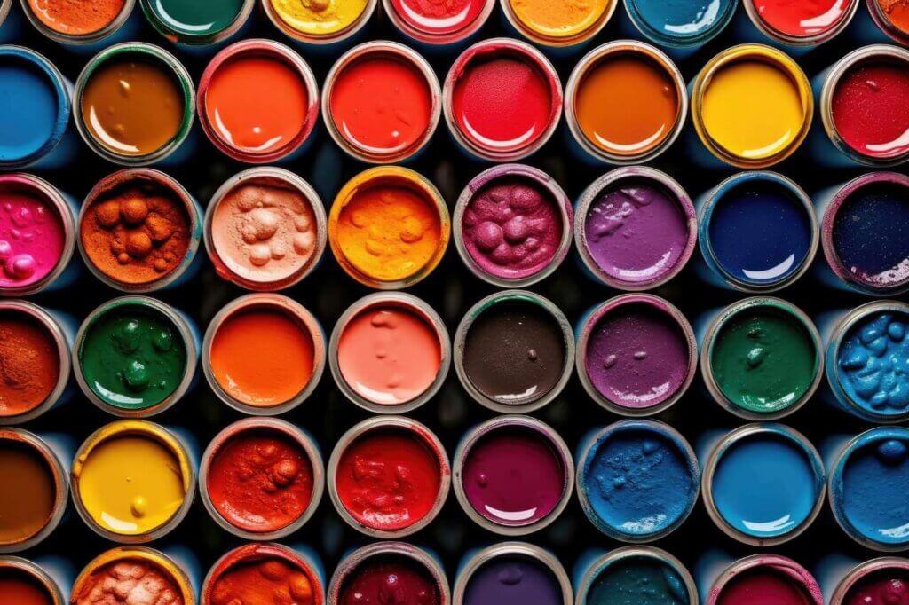
Gone are the days when garden screens came in exactly two colours: brown or green. The options now are practically endless.
There’s something timeless about cedar, redwood and teak tones. They weather beautifully – sometimes even looking better after a year in the elements. These shades add privacy and style to your garden without trying too hard, letting your plants take centre stage.
Greys have absolutely exploded in popularity, and I’m here for it. From soft dove grey to moody charcoal, these neutrals work with practically any garden style. They’re especially perfect if you’ve got colourful furniture or vibrant planting, as they won’t compete for attention.
Sometimes subtle just won’t cut it. Colourful screens can create a dramatic backdrop that makes even ordinary plants look like they belong in a high-end garden magazine.
North-facing garden? White or cream screens might be your best friends. They bounce what little sunlight there is around the space, brightening gloomy corners. Just be prepared for a bit more cleaning – they do show dirt more readily than darker options.
Feeling overwhelmed by choices? Let’s break it down.
Start by looking at what you already have. What colour is your house? Your shed? Your favourite garden furniture? You don’t need everything to match perfectly, but jarring contrasts rarely work well unless you’re deliberately going for an eclectic look.
Are you nurturing a cottage garden bursting with colourful blooms? A sleek modern space with architectural plants? Your garden’s personality should influence your colour choice. Traditional spaces often look best with heritage colours, while contemporary gardens can handle more daring options.
Take a good look at your garden at different times of day. Screens in sunny spots can handle darker colours without making the space feel gloomy. In perpetually shady corners, lighter screens prevent the area from feeling like a cave.
Who says you need to stick with just one colour? Some of the most striking gardens use colour creatively.
Many screens come with frames in different colours than the panels themselves. This can tie in beautifully with other elements – imagine a screen with charcoal panels but copper-toned frames that pick up the same hue as your garden lights or water feature.
Different areas in your garden serve different purposes, so why not reflect that in your screen colours? Warmer tones create sociable spaces perfect for dining areas, while cooler colours foster tranquillity in meditation spots or reading nooks.
Your house provides context for your garden. We’ve seen Tudor-style homes paired with ultra-modern neon screens – not a look that works for most people. The architecture doesn’t dictate your choices, but it should certainly inform them.
In tiny gardens, restraint is key. Too many different colours create visual chaos in limited spaces, so if you’re working with a postage stamp garden, a cohesive colour scheme will make it feel more spacious and considered.
That pristine white screen might look fabulous on installation day, but how will it look after a season of rain splashing mud onto it? Some colours are simply more practical than others, depending on your tolerance for maintenance.
You know your garden better than anyone. Whether you want to explore different ways to use your garden screens or you’re simply focused on basic privacy, colour makes a massive difference to the end result.
Take your time with this decision – it’s not just about what looks good today but what will work throughout the seasons and alongside your evolving garden. The right colour transforms a functional screen into a design feature that elevates your entire outdoor space.
And remember – there are no absolute rights or wrongs here. The perfect colour is ultimately the one that makes you smile every time you step into your garden.
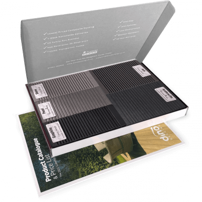
Our sample pack contains a sample piece of each colour currently available. Order your free sample pack today to compare the colours and get a true feeling of the Dino Decking range!
If you are looking to install any type of cladding, including composite cladding, it is important to think about how
You might love your garden, but are you really making the best use of it? Nobody uses their garden all